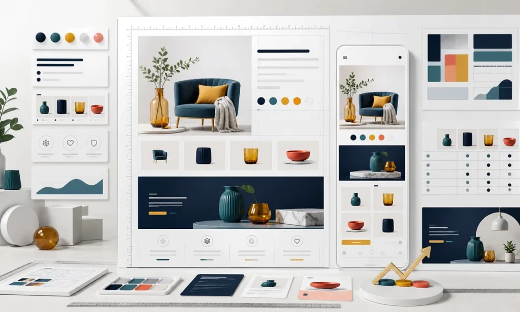
Good amazon a+ content design is one of the few upgrades on a product page that shoppers consciously notice. I build and review A+ pages constantly as part of operating accounts in the US and Mexico, and the gap between a thoughtful A+ layout and a lazy one is visible the moment you scroll: one answers the shopper’s questions before they ask, the other is a wall of pretty pictures that says nothing. This guide covers the modules, the sizes to design for, the basic versus premium question, and the design mistakes I keep correcting.
What A+ Content Is, and Who Gets It
A+ content is the rich visual section that replaces the plain-text product description for sellers enrolled in Brand Registry. Instead of a paragraph of text, you compose the section from modules: banners, image-and-text combinations, comparison charts and more. That Brand Registry requirement is not negotiable, which is one more reason I tell every brand to start their trademark early. If you are not enrolled yet, fix that first; A+ is one of the main things you are unlocking.
Does A+ help rankings? My honest read: mostly indirectly. The text inside your A+ images is generally not indexed the way listing copy is, so treat A+ as a conversion asset, not a keyword asset. Conversion, of course, feeds everything else.
The Modules That Matter in Amazon A+ Content Design
Amazon offers a menu of standard modules, and you combine several to build the section. The ones that carry most of the weight in my layouts:
- Brand logo module. A narrow strip, around 600 by 180 pixels, that anchors the section with your brand mark. Small, but it frames everything below as brand-owned content.
- Standard image header with text. The classic banner, around 970 by 600 pixels, and usually the most valuable real estate in the whole section. Lead with your single strongest selling point here, not a generic lifestyle shot.
- Image and text combinations. Side-by-side and multi-image modules that pair a visual with short copy. These are your workhorses for features, use cases and how-it-works explanations.
- Comparison chart. A table comparing several of your own products. This module quietly cross-sells your catalog and keeps shoppers inside your brand instead of bouncing to a competitor.
- Standard text modules. Useful in moderation for details that genuinely need words, like care instructions or compatibility notes.
One important housekeeping note: module names, dimensions and file requirements have changed over the years, so verify current specs in Seller Central before you brief a designer. Design at the exact required dimensions, because Amazon will not gracefully fix a wrong-sized upload for you.
Basic vs Premium A+: Which One Should You Use?
Basic A+ is the standard tier available to brand-registered sellers. Premium A+, often called A+ Premium, offers larger modules, video, interactive elements like hover hotspots, and carousel layouts that simply look more like a modern brand website. Amazon has adjusted the eligibility criteria for Premium over time, so check what your account qualifies for in Seller Central rather than relying on any blog post, including this one.
My practical guidance: basic A+, executed well, beats premium A+ executed lazily, every single time. Premium earns its keep on hero products with meaningful traffic, where video and larger visuals can address complex objections. For the long tail of your catalog, disciplined basic modules are usually the better use of design budget.
The Design Mistakes That Kill Conversion
Most of what goes wrong in amazon a+ content design is not artistic; it is strategic. The pages look fine in a design review on a big monitor and then fail quietly in front of a shopper on a phone with eight seconds of patience. These are the problems I correct most often when I take over an existing account:
- Tiny text baked into images. Most of your shoppers are on phones. If the copy inside your banner is unreadable at mobile width, it does not exist. Check every module on a phone before approving it.
- Repeating the bullets verbatim. A+ should add new information, answer objections, show scale and context, not restate what the shopper just read above the fold.
- All lifestyle, no substance. Beautiful ambient photography with zero information is decoration. Every module should answer a question a real buyer has.
- Skipping the comparison chart. If you sell more than one product, this module is free internal traffic. I add it to almost every A+ page I build.
- Ignoring localization. If you also sell on Amazon Mexico, your A+ needs native Spanish, redesigned text overlays included. Reusing English banners in a Spanish marketplace tells shoppers exactly how much you care.
- Never measuring. Publish, then watch what happens to conversion. A+ is testable like everything else, and treating creative as an experiment rather than a one-time art project is the core habit behind our data-driven digital marketing approach.
Frequently Asked Questions
Does A+ content cost extra?
Basic A+ has been included for brand-registered sellers, while Premium availability and terms have shifted over time. Check the current conditions in Seller Central for your account rather than trusting secondhand information.
How often should I update A+ content?
Not on a calendar; on evidence. Update when reviews and customer questions reveal objections your current modules do not answer, when the product changes, or when a test shows a layout underperforming.
Designing, localizing and publishing A+ content, in English and native Spanish, is part of the standing scope in our Amazon account management service.
Want a second pair of operator eyes on your product pages? Schedule a call and I will tell you which modules are working and which are wallpaper.
Keep reading
- Amazon Brand Registry: Requirements and Why It’s Step One
- Amazon Listing Optimization: What Actually Moves Rankings
- How to Increase Amazon Sales: What Actually Moves the Needle
Would you rather have us run it? See our Amazon account management service.
Finding this analysis useful?
Get one email a week with the most important developments in AI and business technology — explained in plain English, with real numbers and zero spam.
Want this working in your business?
Book a free 30-minute session: we look at your case and tell you what is worth doing (and what is not) — no strings, no sales pitch.
Book a free session →